
Looking at my painting today I noticed I'd created a very angry sky. The clouds appeared to be ominous like they're on the verge of breaking into a thunderstorm. Not the peaceful sunrise I was aiming for. Time to cool it down.
Purple is a cool color. But this color appeared too aggressive in my clouds, probably because of all the yellow in the sky. The contrast of these color opposites (aka-complementary colors) was too great.

 1. I began to add a wash of blue to the left side of the sky. Not only did this cool down the temperature of the colors but it reinforce my focal point - the sunrise on the right.
2. I still wanted the feeling of billowy clouds so I fluffed in some white.
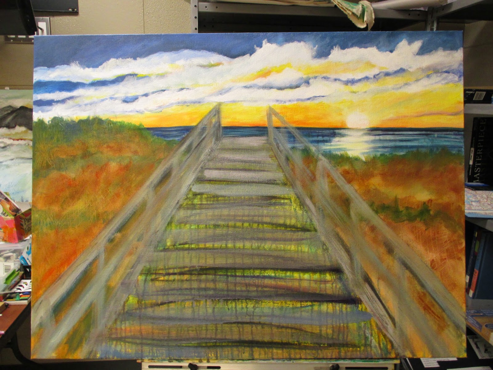 3. I brightened the horizon line with a wash of orange and pink. Then I added a little more color to the ocean. Before I finished the painting session I "cleaned" my palette by adding some color to my dunes and boardwalk, I never like to waste paint.
Tonight I meet with my painting group and am ready for critique. I can't wait for their feedback on my work!
No comments:
Post a Comment