Wednesday, July 31, 2013

We own 3 houses but live in our RV

Let me clarify a little.  We don't actually live in an RV, we live in our fifth wheel.
I'm not quite sure why it's called a 5th wheel, it's only got 4 as far as I can see. What about our houses? The one in Katy is rented out (we thought we were moving back to VA) and the one in Louisiana is in litigation (Chinese drywall = unsellable house).  Our house in Virginia is being looked after by many capable people and has become "Karen's Bed and Get Your Own Breakfast."

Anyway the 5th wheel is our home for now because I've relocated back to Katy, TX for the school year. It's cozy and comfortable plus we got a sweet spot by a little fake lake.  Joe picked up a golf cart for scooting around to the laundry, pool, trash and visit neighbors. This year is going to be an exercise in simplicity for me. Having restricted space is requiring me to get more organized.  I have to constantly decide "Do I really need ____?"

If you had to scale your living space down to 2 rooms what could you do without? I have a husband and a dog so I have simplify even more to share this space.  I've reduced my wardrobe (I only brought 5 pairs of shoes with me!), emptied my cabinets (don't need more than 4 plates, especially since there is no dishwasher), and started to shop like a European (tiny fridge and pantry).  I've learned how to multitask by doing 5 loads of laundry simultaneously while I answer emails, write blogs, and pay bills (I've reduced paper by setting up all ebills.) I've fallen in love with the 3M removable hooks - I've put them everywhere!  But most importantly I'm figuring out how to live with whatever is most essential. Because as long as I'm in the same place as my husband, Joe and my dog, Dasher I'm going to make it a home.

Simplifying and decluttering are great ways to clear my mind too.  I'm no longer crawling over piles of paper and digging through an over stuffed closet.  I read a book recently by Andrew Mellen called Unstuff Your Life to help me figure out how to get organized.  His book and website are a gold mine of information. When deciding where to put things always remember "everything has a place and like goes with like," Mellen says. That makes so much sense!

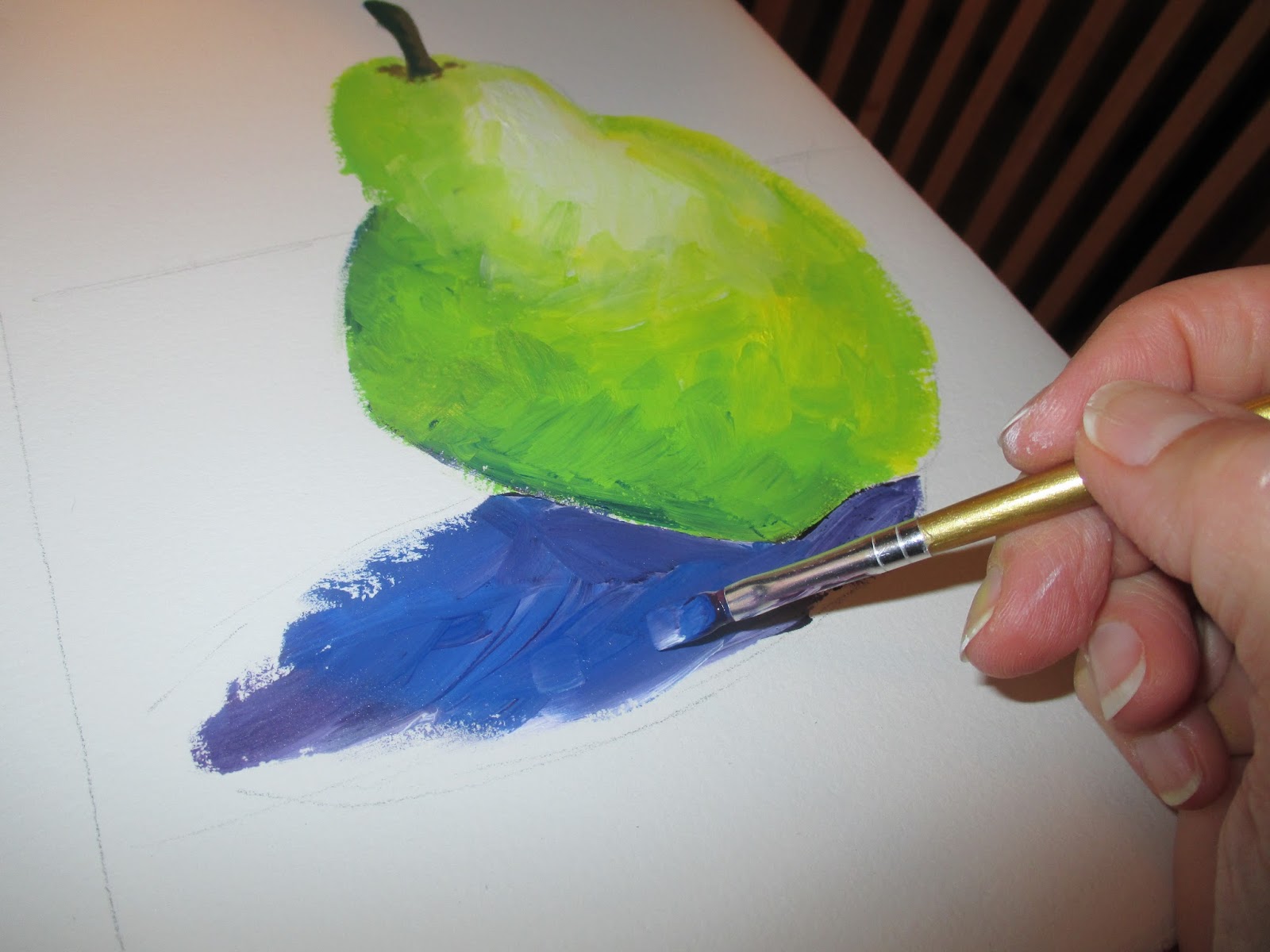
Art supplies-definitely essential! 
I'm not ready to share too many pictures of my organized living space,  it's still a work in progress.  I spent hours yesterday at Ikea and other container stores looking for ideas. I didn't solve all of my storage problems, but I left with a new clothes hamper and a few small boxes. I did get a few areas organized.

So I challenge you to create some organization in your life.  Clear out your desk.  Rearrange your kitchen. Set up your art space for instant creativity.  Even cleaning out your purse will give you satisfaction. Enjoy the simplicity!


Tuesday, July 30, 2013

Art Basics: Acrylic Paint

To teach acrylic painting in one blog post is a pretty ambitious thing.  But I think I can give you the basics, especially if you've been reading my previous posts. You'll need to purchase some supplies.  I recommend going to an arts and crafts store and buying the three primary colors- Red, Blue and Yellow in addition to a tube of white.  Liquitex Basics is a great brand to start out with.  You'll also want to pick up a few brushes.  Get 3-4, some round and some square tips.  A bottle of Matte Medium is helpful to thin your colors (instead of water).  You can either paint on watercolor paper or canvas board.  I use paper plates for my palettes - saves cleanup time.  You'll also need plenty of water, paper towels and your object to paint.  I still have the pear, no one's eaten her yet!


1. Squeeze a small amount of the primary colors and white onto one plate. Put some matte medium on too.  I mix a small amount of this into each color to thin them.
2. On the second plate you're going to be mixing the secondary colors. Put a small amount of yellow next to red, yellow next to blue and blue next to red.
3.  TIP- Mix a small amount of the darker color into the lighter color.  It's always easier to make a color darker than lighter.


4.  Now you're ready to paint your value scales.  Put a small amount of your color on one side and white on the other.  Spread the white over until you start mixing it with the red.  Continue blending until you get a value change.  You may have to go over it a couple of times with white.

Try this with some other colors.


5.  Create some spheres using basically the same technique and analogous colors.  Start with white at your lightest spot.
6. Then paint green on the other edge.
7.  Begin adding blue to the darkest area- blend the paint.
8. Add yellow close to the light source.
9.  TIP- When you get your colors laid down pick up a clean, relatively dry brush and use it to blend the colors.  Continue wiping this brush on paper towels as you blend.


10.  Try this with all the secondary colors. (orange/red/yellow & purple/blue/red)
11. Then try using the complementary colors for creating darker values.

Let's try this with the ever present "Miss Pear"
1.  Lightly sketch the object with a pencil.
2.  Paint white on the lightest area.
3.  Paint yellow next.
4. Then green.  Get a clean brush and blend these colors.
5.  Now add some blue to the darkest edge and blend well.
6.  You may need to go back in with white, yellow and green if your paint is getting dry.


7.  For the stem I mixed some blue into orange to get a brown.  To make the edge of the stem darker I painted a little more blue there.
8.  The shadow is painted with blues and purples. I used a little bit of white to lighten the shadow up a little. I also added a touch of the brown to the really dark edges.  I blended it all with a clean brush


9.  For the dramatic background I used more blue and purple. As I painted further away from the pear I added a little white.


Whew, that wasn't an easy lesson to write.  There are so many nuances to acrylic painting which I couldn't begin to explain in one lesson.  But have some fun and experiment!

Brush strokes are a beautiful characteristic of opaque paint. Don't try to over blend!


Monday, July 29, 2013

Art Basics: Watercolors

Are you afraid?  Most people love to look at watercolor paintings but are afraid to try to paint one.  I'm going to give you what I consider the most important tip to using this fun and versatile medium.  The funny thing is that the clue is in the name:  WATERcolor.  That's right, the most important thing to learn about watercolor painting is how much water you need to use.  So let's dive right in.  The water is perfect!

Watercolors are a transparent medium.  This means that you never want them to be thick and shiny when dry.  You want the paper to absorb the paint.  You want the colors on underneath layers to show through.

Today I'd recommend you invest in watercolor paper.  It works so much better than drawing paper for this kind of exercise.  I used good old Crayola watercolors.  If you find you like this medium you might want to invest in some better paint.  Let me know - I'll give you some recommendations.  You'll also want a couple of different paint brushes.  Just make sure they are soft and flexible.  A big cup of water, a cold drink for yourself and an everyday object (yes, Miss Pear is still alive.) I've included a lot of pictures today.  I'll make a video soon.

 Once again let's create a value scale using the primary and secondary colors.  The watercolor technique we'll be using is called wet-on-wet.  This simply means that you wet your paper with clear water first and then apply the wet color.  The paint will move wherever the water is and bleed across your paper.  To get a lighter effect rinse your brush after applying the color and with that wet brush just drag some color until it's very faint.  Consider the white of your paper is your white paint!


1.  Draw 3 rectangles and 6 circles on the paper with pencil.
2.  On the first rectangle paint clear water.
3.  Load you brush with one color and gently paint it on the edge of the rectangle.
4.  Rinse your brush with water and gently blend the paint across the rectangle.  Rinse and dry your brush so that the color gets fainter and fainter.
5.  Now try this on the first 3 circles.  Wet with clear water, dab color along one edge, rinse your brush and blend the color getting fainter as you get to the light source. You can use a tissue to blot out areas that you want less color.


6. Paint the next 3 circles yellow using the same wet-on-wet technique. Dry these circles completely.  I used my hairdryer to speed the process.
7.  Now add layers of analogous colors on top of the yellow to create a transparent glaze of color.  Paint gently so you don't lift off the yellow. Completely DRY BETWEEN LAYERS! The one on the far left I did with orange and then red.  The second one was with green then blue.
8.  The third one I did with the complementary color to give a neutral tone.


Let's bring out "Miss Pear" again.
1.  Lightly sketch your everyday object with a pencil.  
2.  I painted clear water over my pear.  Then I painted it yellow using wet-on-wet.  Completely DRY.
3.  Now LIGHTLY paint clear water on the yellow and drop in some green.  Completely DRY.

4.  Again lightly paint clear water and drop in some blue.  Completely DRY.
5.  Paint the stem with some brown.  I also wet the area around where the stem is connected and let some brown bleed onto the pear.  DRY again.
6.  Now add a little blue to the stem.  This will make it dark on the edge


7.  Paint the shadow under the pear with blue and purple using wet-one-wet.  DRY.  Then paint a little brown in the darkest areas of the shadow - the reverse of what you did on the stem. I even dragged a little on to the pear to give it more shadows.
8.  Lastly I painted the negative space with the blue and purple wet-on-wet again to give my pear a dramatic background.


Did you notice how I kept emphasizing  DRY?  That's because the second most important thing you need to know about watercolors is that your paper needs to be completely DRY between layers.  That's how you get glowing edges and transparent glazes.


Tomorrow we're going to try acrylic paint.