

To teach acrylic painting in one blog post is a pretty ambitious thing. But I think I can give you the basics, especially if you've been reading my previous posts. You'll need to purchase some supplies. I recommend going to an arts and crafts store and buying the three primary colors- Red, Blue and Yellow in addition to a tube of white. Liquitex Basics is a great brand to start out with. You'll also want to pick up a few brushes. Get 3-4, some round and some square tips. A bottle of Matte Medium is helpful to thin your colors (instead of water). You can either paint on watercolor paper or canvas board. I use paper plates for my palettes - saves cleanup time. You'll also need plenty of water, paper towels and your object to paint. I still have the pear, no one's eaten her yet!


2. On the second plate you're going to be mixing the secondary colors. Put a small amount of yellow next to red, yellow next to blue and blue next to red.
3. TIP- Mix a small amount of the darker color into the lighter color. It's always easier to make a color darker than lighter.


4. Now you're ready to paint your value scales. Put a small amount of your color on one side and white on the other. Spread the white over until you start mixing it with the red. Continue blending until you get a value change. You may have to go over it a couple of times with white.
 Try this with some other colors.
5. Create some spheres using basically the same technique and analogous colors. Start with white at your lightest spot.
6. Then paint green on the other edge.
7. Begin adding blue to the darkest area- blend the paint.
8. Add yellow close to the light source.
9. TIP- When you get your colors laid down pick up a clean, relatively dry brush and use it to blend the colors. Continue wiping this brush on paper towels as you blend.


10. Try this with all the secondary colors. (orange/red/yellow & purple/blue/red)
11. Then try using the complementary colors for creating darker values.

Let's try this with the ever present "Miss Pear"

 1. Lightly sketch the object with a pencil.
2. Paint white on the lightest area.
3. Paint yellow next.
4. Then green. Get a clean brush and blend these colors.
5. Now add some blue to the darkest edge and blend well.
6. You may need to go back in with white, yellow and green if your paint is getting dry.


8. The shadow is painted with blues and purples. I used a little bit of white to lighten the shadow up a little. I also added a touch of the brown to the really dark edges. I blended it all with a clean brush
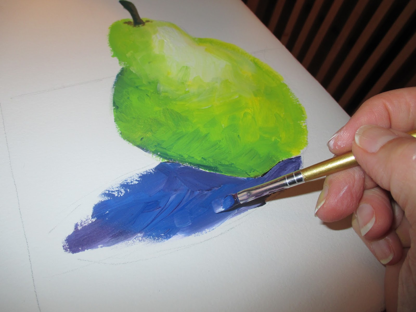


9. For the dramatic background I used more blue and purple. As I painted further away from the pear I added a little white.

Brush strokes are a beautiful characteristic of opaque paint. Don't try to over blend!
You make this look so easy and effortless! Awesome step by step instructions and beautiful artwork!
ReplyDeletePeggy (from UBC)
***
Peggy Nolan
http://thestepmomstoolbox.com
Wow, I needed this art lesson! You are an incredible artist and thank you for sharing the colors to use and now I wish I had a drawing bone in my body and could practice this. I'm going to work with my Big Shot today and make greeting cards. I will save this one and try to do it for my mom! She is always happy with the things I do for her. I'll make a greeting card for her with the pear and a recipe on the inside of the card! Thank you for sharing so much about this technique!
ReplyDeleteRegards, Carolyn
http://conversationswithcarolyn.blogspot.com/
Great group of tutorials. I like how you've used several different mediums with the same image. Awesome photos and details. So grateful to be on the wild and crazy journey with you!
ReplyDelete